

There is a persistent myth in wedding and event design that elegance belongs exclusively to a narrow palette: white, ivory, blush, perhaps a little green. These combinations endure for good reason. They are timeless, versatile, and beautiful.
But color deserves a more thoughtful defense.
Used carelessly, color can feel loud. Used intentionally, it becomes architectural.
A rainbow-inspired floral tablescape designed for a vibrant bridal shower in Pittsburgh. Saturated blooms arranged in a flowing spectrum of color created a playful yet sculptural centerpiece. Floral Design by Mary Beth McConahey. Event Styling by Sara Judith Events. Photo by Lauren Renee Photography.
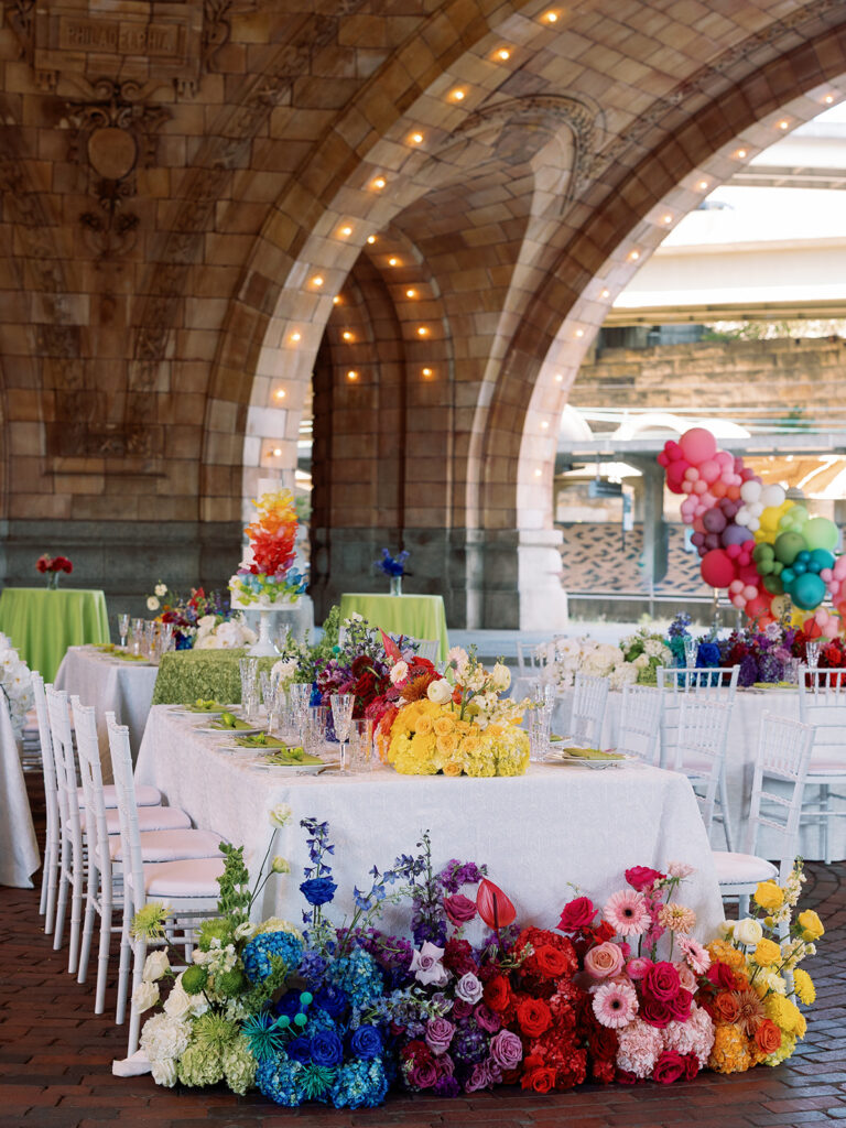
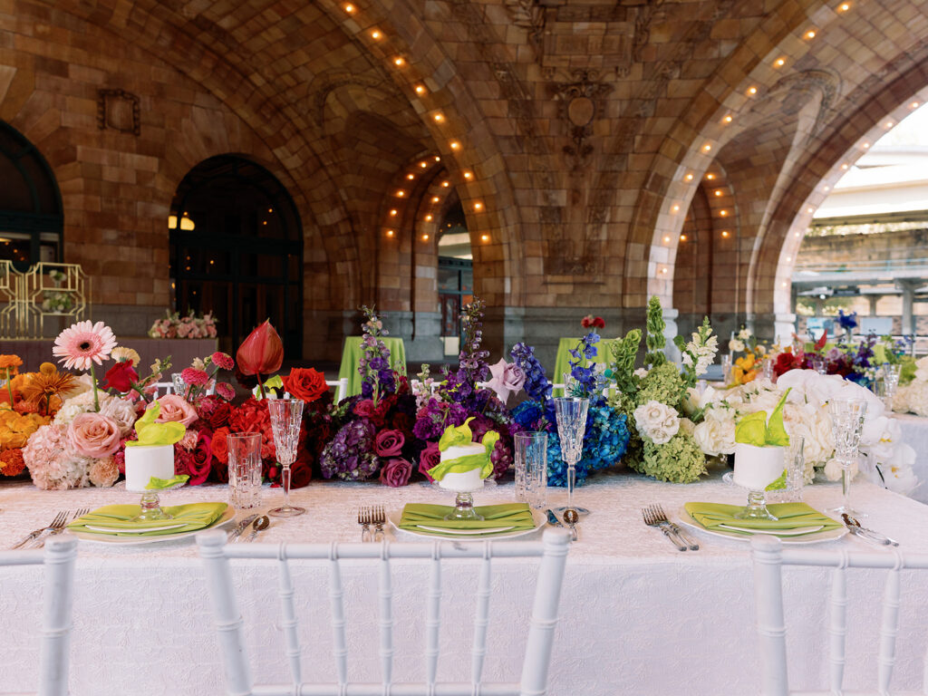
This editorial installation at The Pennsylvanian explored what happens when color is treated not as decoration, but as structure. Four long tables unfolded beneath the rotunda in a gradual chromatic progression, moving from cobalt and violet through scarlet, coral, saffron, chartreuse, and back again. Rather than competing with one another, the colors were organized carefully, each hue creating a bridge to the next.
The result was not chaos, but rhythm.
Photograph by Lauren Renee Photography
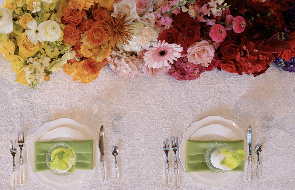
One of the challenges of working with saturated color is restraint. The temptation is often to use every beautiful flower available. Yet the success of a colorful palette depends less on abundance than on editing. Color requires discipline. Every bloom must earn its place.
Photograph by Lauren Renee Photography
Against the stone architecture and grand scale of The Pennsylvanian, the palette felt surprisingly natural. The flowers became less about individual varieties and more about movement across space — a visual conversation unfolding from one end of the room to the other.
For couples and hosts considering color, the lesson is simple: sophistication does not belong exclusively to neutral palettes.
A room can be joyful and refined.
Bold and restrained.
Vibrant and elegant.
The most memorable designs are rarely the ones that follow a formula. They are the ones that embrace a point of view.
This installation was created as an exploration of that idea — a celebration of color used with intention, confidence, and care.
Because flowers are capable of much more than matching a palette.
They can shape an atmosphere.


